Valcorra
Valcorra launched as a new brand for water treatment and slurry handling equipment, into a market where every competitor has decades behind them. It needed an identity that could stand on a quarry site beside established manufacturers, and a naming system that holds up as the range grows. The launch date was already set.
Results
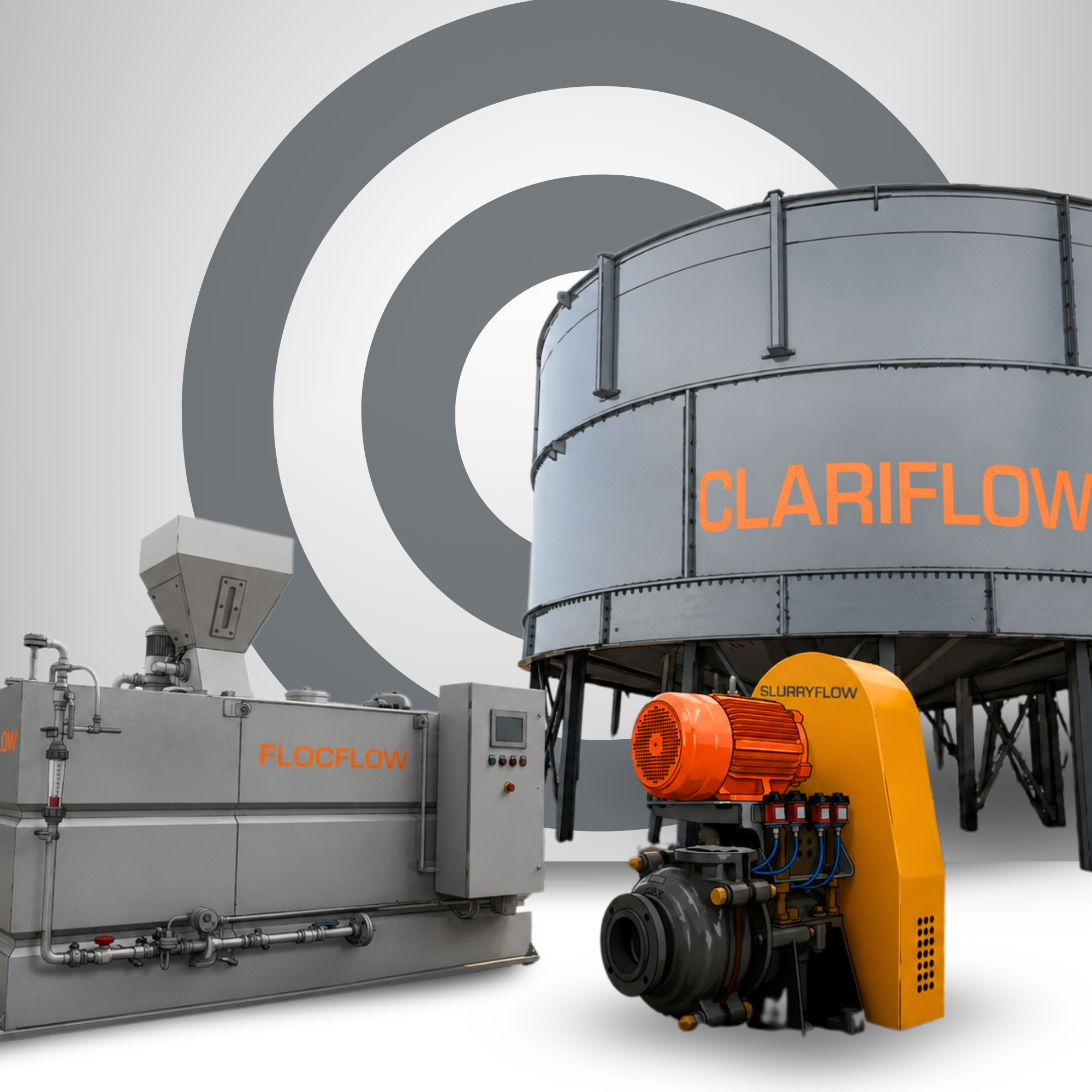
Valcorra launched with a full identity: logo, brand guidelines, technical documentation, an operating manual, product mockups and equipment decals, all on a system that takes the next machine without starting over.
Logo, guidelines, data sheet, operating manual, mockups and equipment decals
A brand framework built to absorb future products without a redesign
From brief to launch-ready brand against a fixed date
Machine shipped with documentation and on-equipment branding in place
Solution
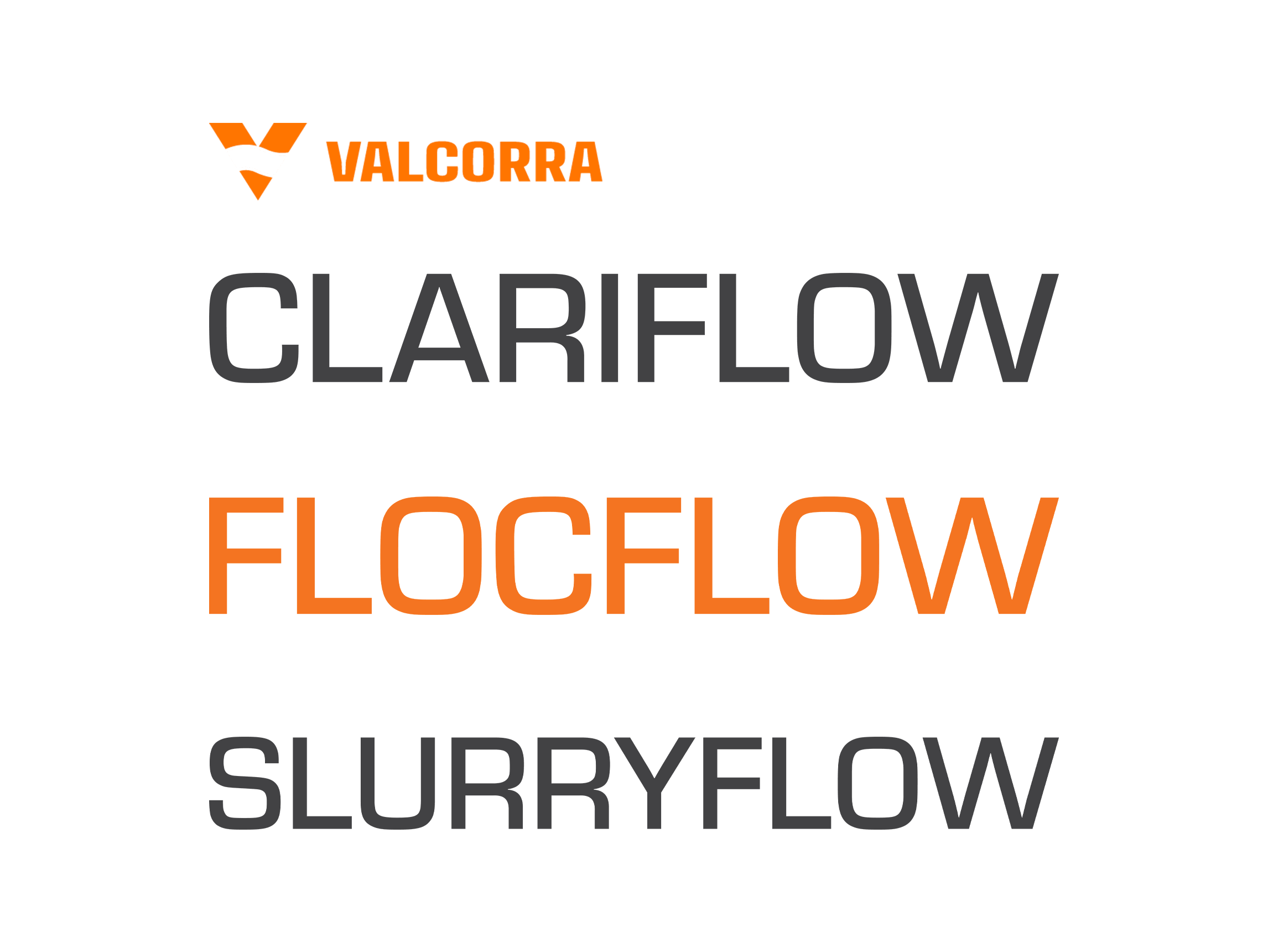
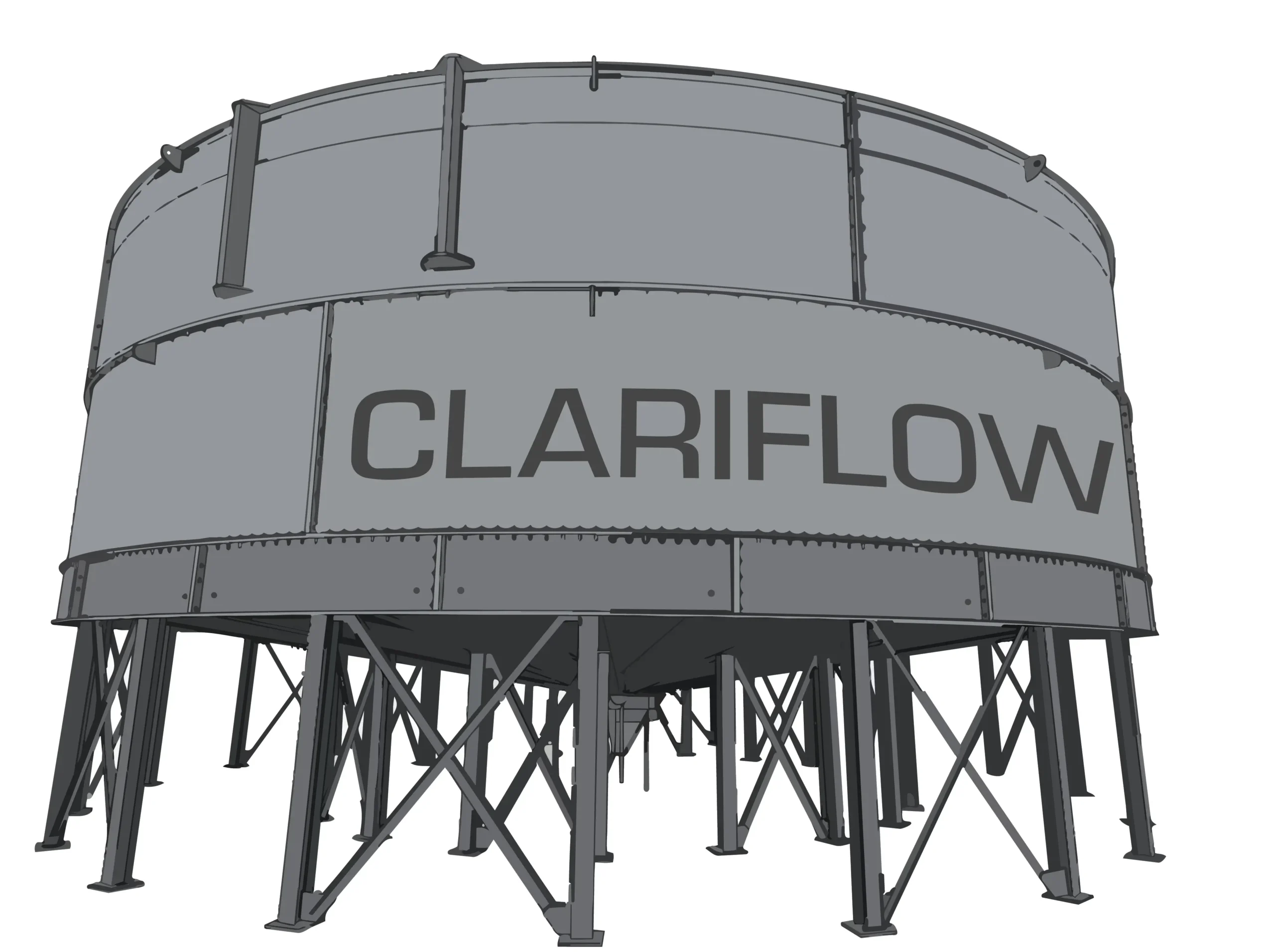
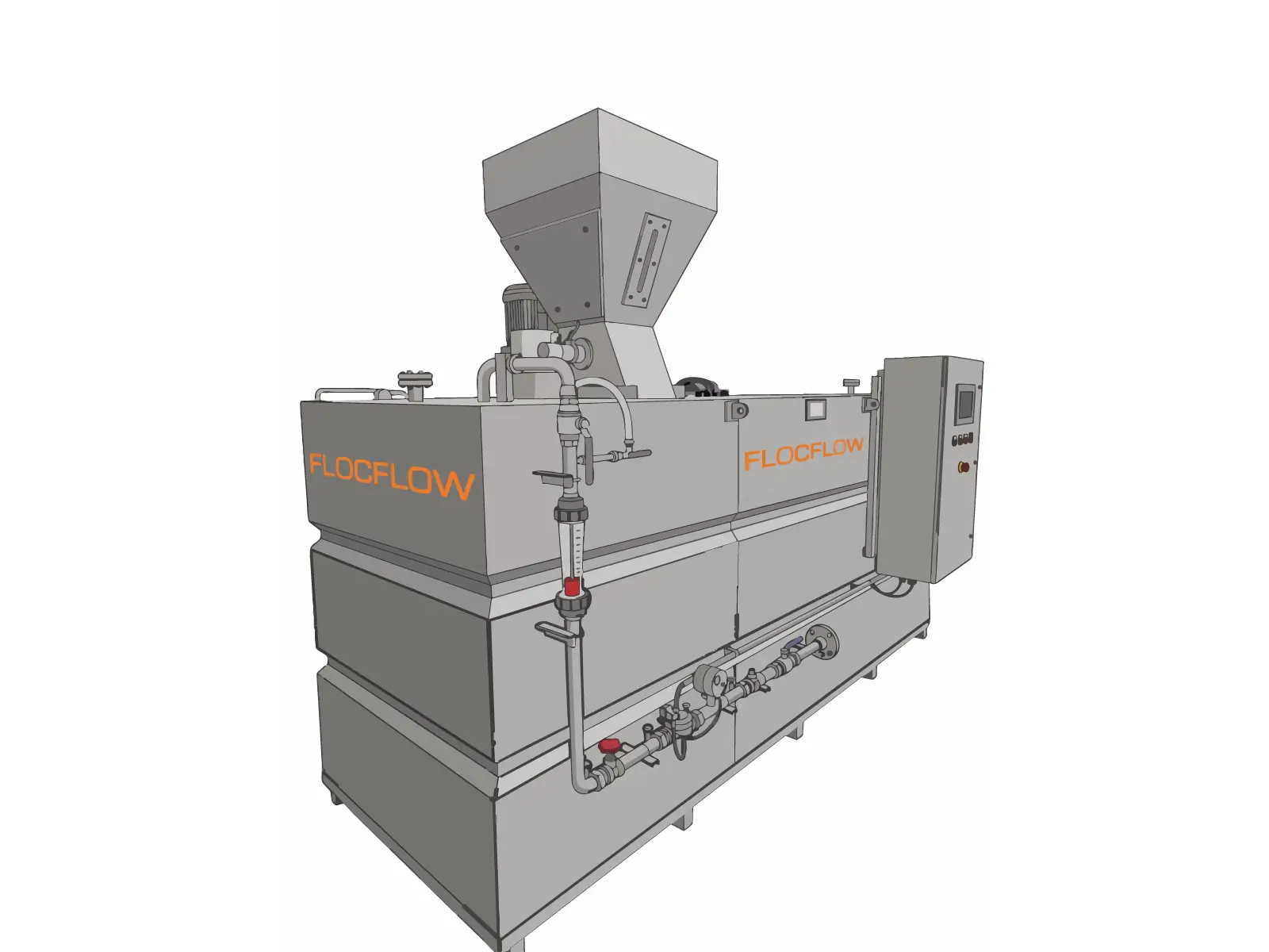
A brand built around one machine ages badly. We set the naming architecture and the colour, type and layout rules at the system level, so Clariflow, Flocflow and Slurryflow read as one family and the next product arrives as a variant rather than an exception.
Process
In materials processing the brand travels on the machine. Every crusher and screen on a quarry site carries a manufacturer's name in a metre of vinyl down the side, so a new one gets judged next to established brands in the same eyeline. That set the constraints: high contrast, a mark that reads at fifty metres and at thumbnail, and a colour that stays itself under site lighting and site grime.
Media & Websites
Logo and colour system, brand guidelines, technical data sheet, operating manual, product mockups and equipment decals, one set rather than a sequence of separate jobs.
We'll tell you exactly where your digital presence is letting you down and what we'd do about it.
A 30-minute conversation with people who already know your industry.