Unispec
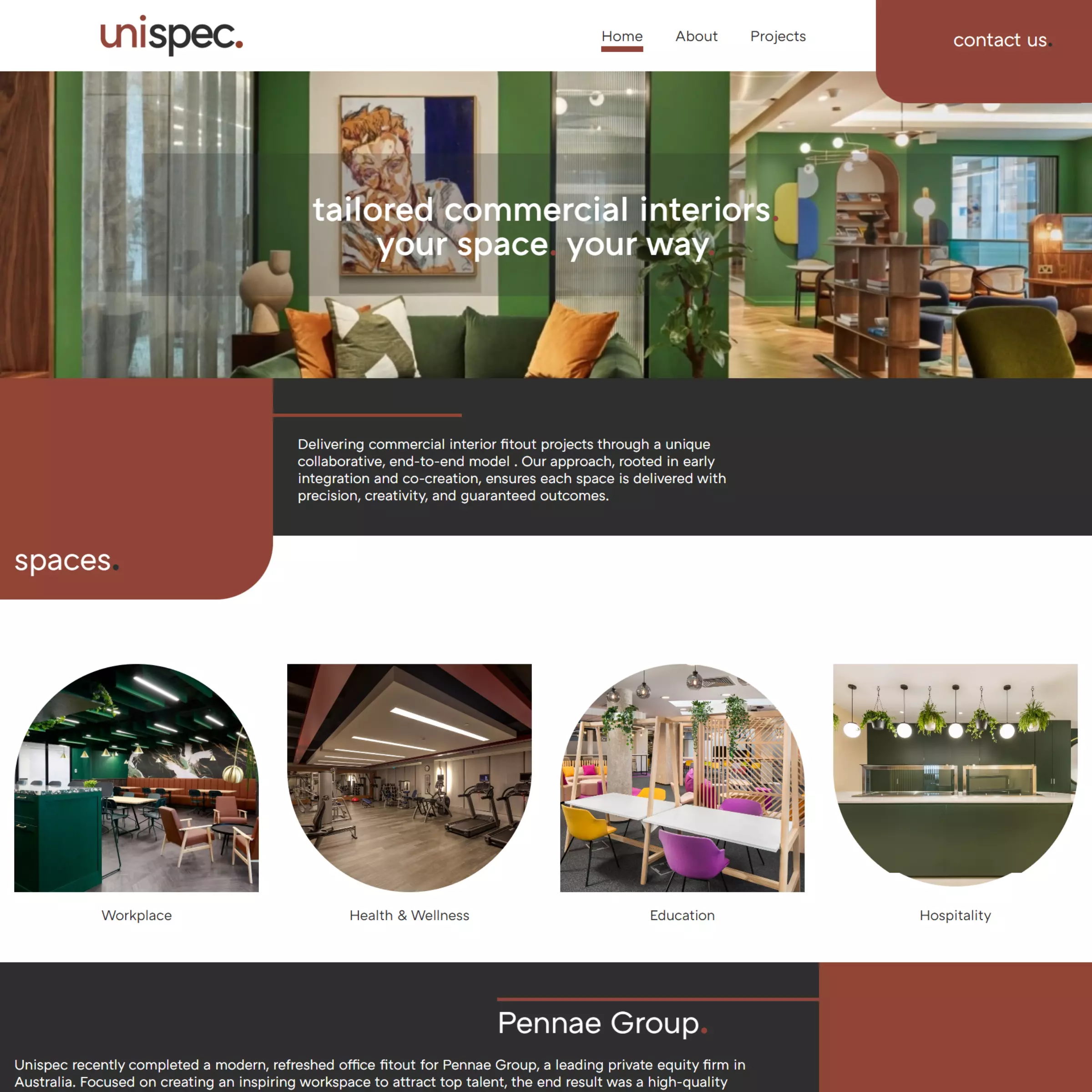
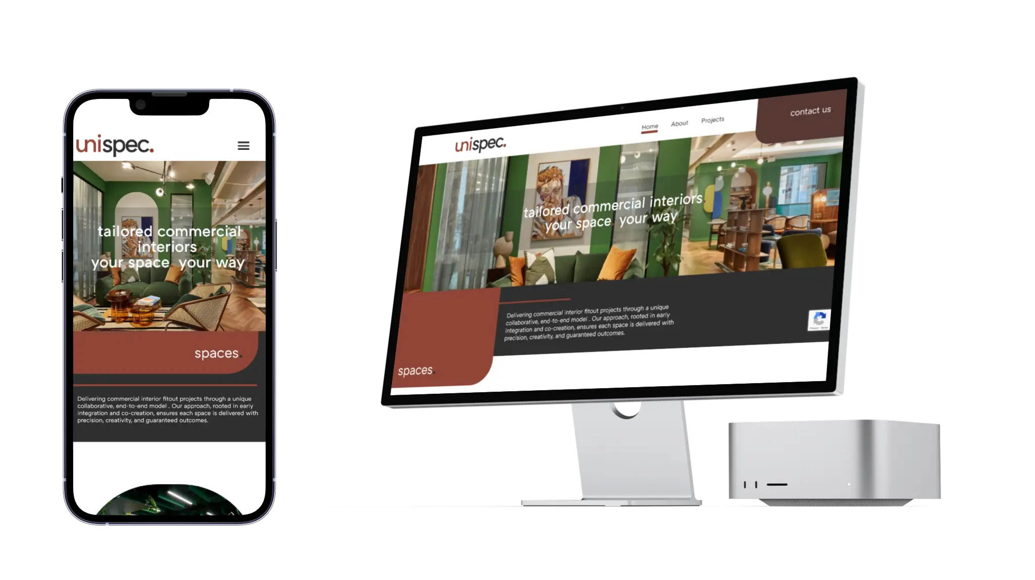
We built Unispec's first website to get a new commercial fitout name noticed. Since then, Unispec has delivered workplace, education and industrial projects across Australia. They made a request for a site that matched where the business now sits: calmer, more restrained, and closer to how an established national contractor presents itself.
Results
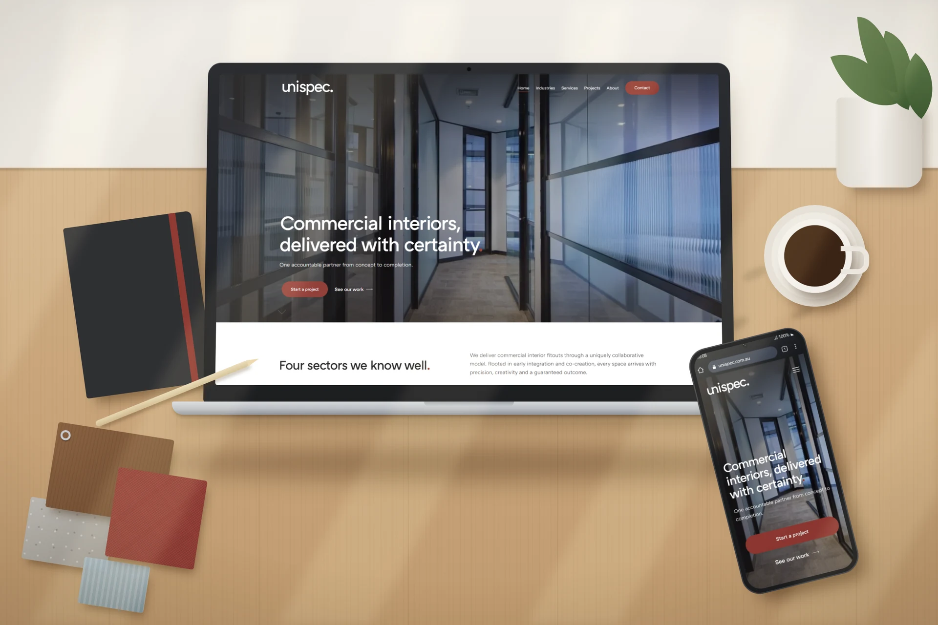
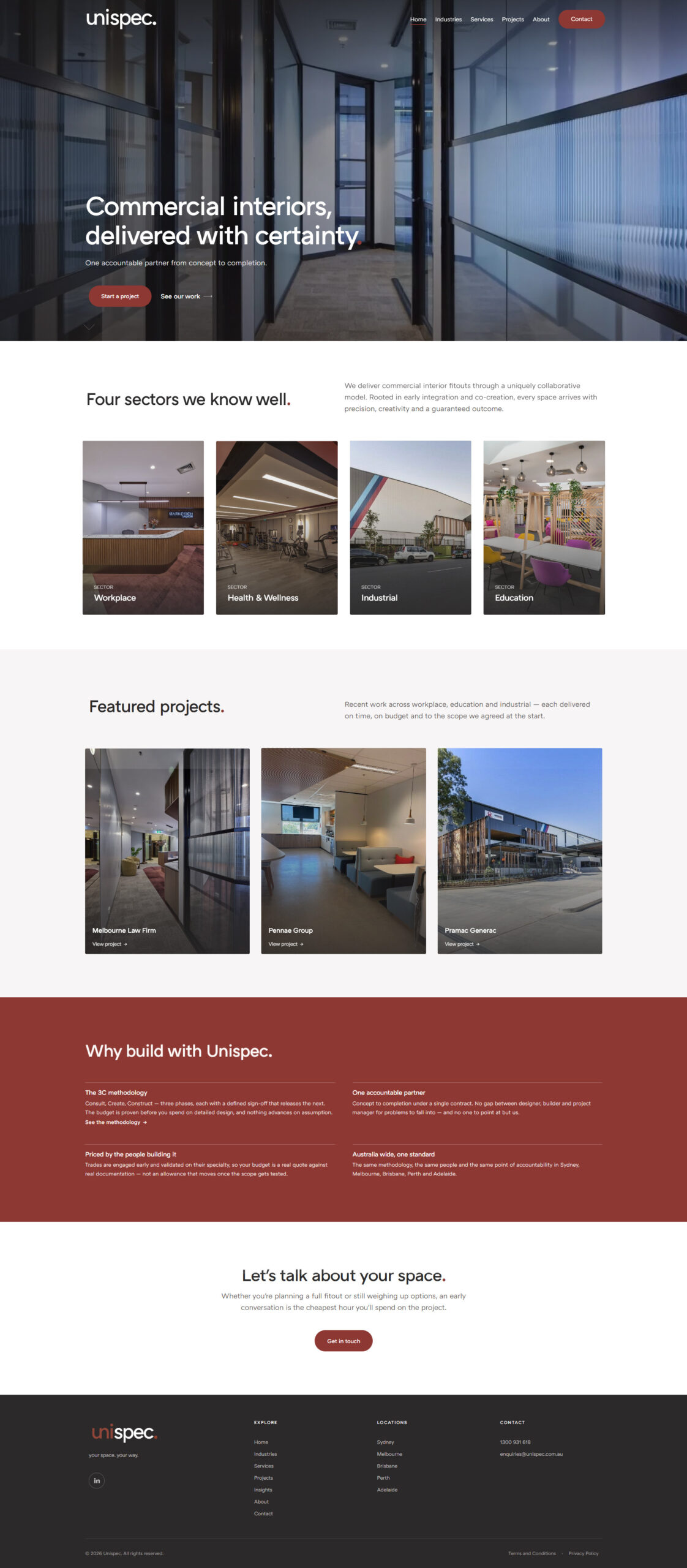
The homepage now answers a buyer's first two questions in order. Have you done work like mine, and how do you run a project? A quote request sits one tap away on every screen.
From brief to live rebuild
One site and one delivery standard for Sydney, Melbourne, Brisbane, Perth and Adelaide
Solution
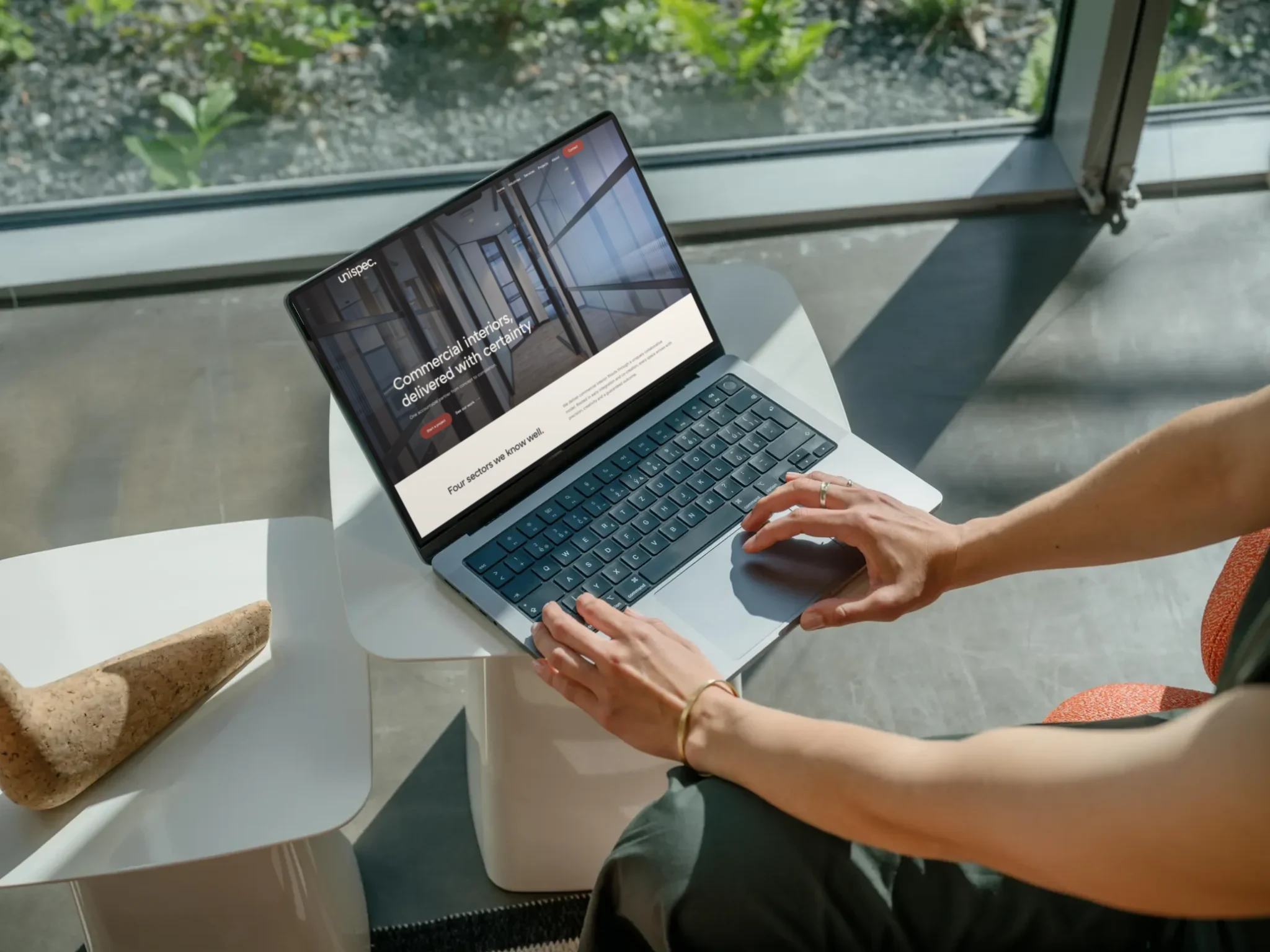
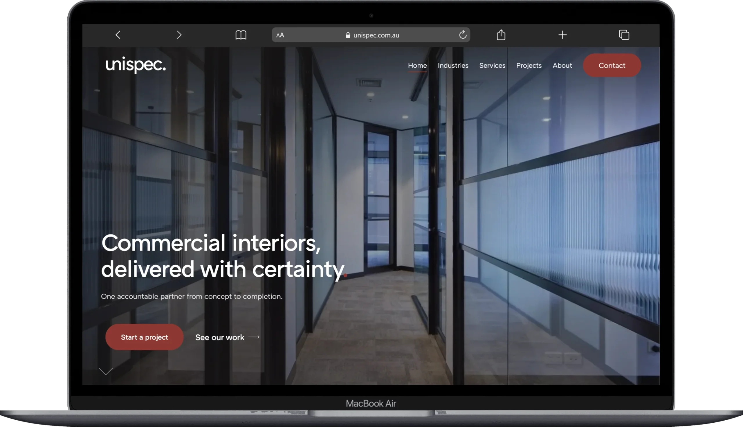
The launch site used colour and playful layouts to make a new name memorable. Now that Unispec has a real portfolio to show, restraint does more of the work. We pulled the interface back to charcoal, white and a single brick red accent, so the project photography does the persuading.
Process
Commercial fitout clients want proof before they want ideas. We reordered the homepage to match that. It opens with four sectors: workplace, health and wellness, industrial, and education. Featured projects come next, followed by the reasons to build with Unispec. The navigation follows the same logic, with Industries, Services and Projects ahead of About.
Media & Websites
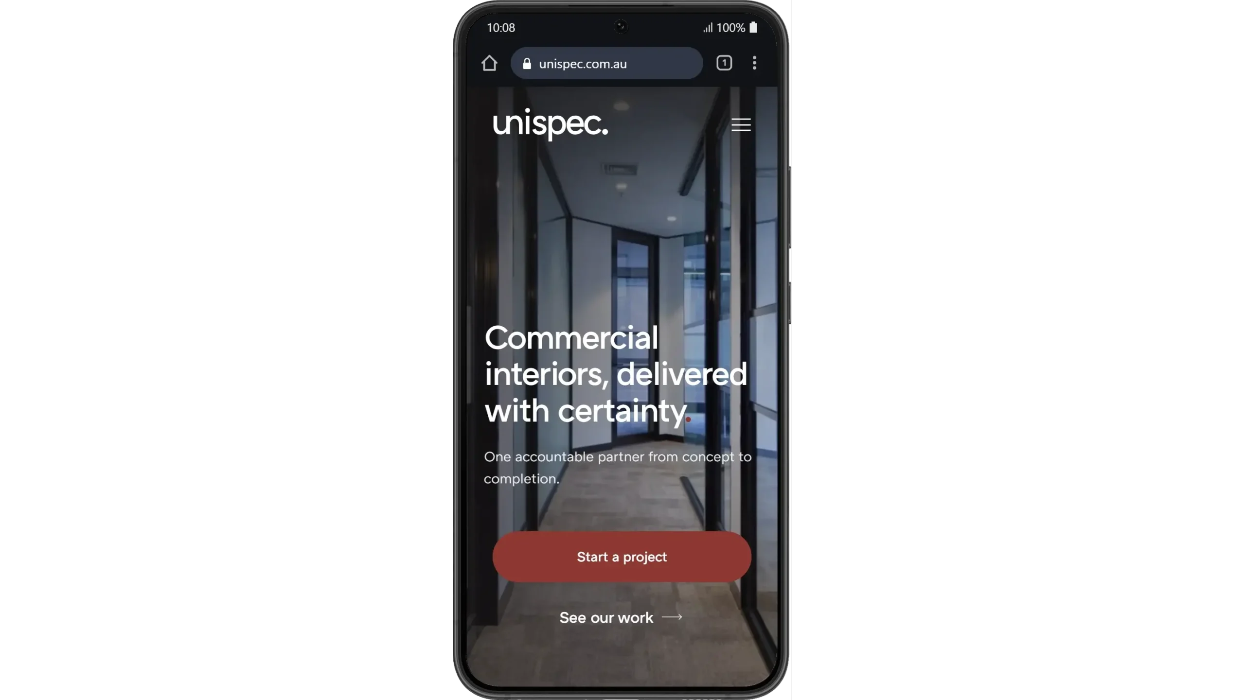
The red full stop from the Unispec logo now closes every major heading, and the same brick red marks every call to action. On mobile, the hero stacks its two buttons full width, which puts the quote request under the visitor's thumb instead of up in a corner.
We'll tell you exactly where your digital presence is letting you down and what we'd do about it.
A 30-minute conversation with people who already know your industry.