
Looks the Part, Misses the Brief
By Gianna Stead | SEO Manager, Maisona | 5 min read
Your B2B website design might be doing exactly what you asked for, and still failing your business. Most briefs handed to designers focus on appearance: modern, professional, on-brand. Reasonable asks. But a brief built around how a site looks rarely produces one built to convert.
This is not a diagnosis of what is wrong with your current site. The five signs your B2B website is costing you leads cover that ground. This is a different question: what should a B2B website be built to do in the first place? The businesses that get the most from theirs started with a better brief.
The Wrong Brief
Most web design briefs read something like: “We want a clean, modern site that showcases our services.” That brief will get you a clean, modern site. It will not get you leads.
The reason is simple. Stakeholders judge websites on how they look. A site that photographs well, loads without errors, and matches the brand guidelines gets signed off. Whether it moves a procurement manager from interest to enquiry, holds up when a sceptical operations director visits for the second time, or answers the questions every buyer arrives with: none of that is in the brief.
Those questions are worth naming:
- Am I in the right place? Do you serve businesses like mine?
- Can you do what I need? Is there evidence, or just claims?
- What do I do next? Is the path forward clear?
Answer all three and the site converts. Leave them hanging and it does not, no matter how much it cost to build.
Pretty, but Slow
Web projects often split design from development: one team owns how it looks, the other owns how it runs. That split is how you end up with a beautiful site that takes too long to load, which is a commercial problem wearing a technical disguise.
B2B sites average 78 seconds per session. That is not long to prove value and earn a next step. Burn three of those seconds on load time and you have lost part of the window before the visitor reads a word.
Speed also affects whether buyers find you at all. Google’s Core Web Vitals use load performance as a ranking signal, so a slow site is marked down in search before anyone arrives. You lose the visitor twice: once in the rankings, and again when the few who reach you decide not to wait. The fix belongs in the brief, not the post-launch list.

Speed Is a Revenue Decision
The link between load speed and revenue is no longer a matter of opinion. When Deloitte and Google studied mobile site data across 37 brands, they found that a 0.1-second improvement in load time lifted retail conversions by 8.4% and average order value by 9.2%. For the lead generation sites in the study, the kind most B2B businesses run, the effect was sharper still: a 0.1-second speed gain produced a 21.6% increase from the first step of a form to the submission page.
Sit with that for a moment. A tenth of a second, a gap most people cannot consciously perceive, moved form completions by more than a fifth. Your buyers are not deciding to abandon a slow site. They are leaving before they have decided anything, and the loss never shows up as a complaint. It shows up as a quieter pipeline.

This is why the “clean and professional” brief often misses. Clean and professional is a style direction, not a performance standard. A homepage loaded with full-width video, heavy imagery, and a dozen tracking scripts can look the part and still bleed conversions on every visit, particularly on the mobile connections your buyers use on a site or in transit between meetings.
The signals that build trust with a B2B buyer in construction, civil, or industrial sectors are not the ones that win design awards. Project scale, real site imagery, named outcomes, and a page that loads before patience runs out carry more weight than typography or scroll animations. Put performance in the brief before the design starts, not on the fix list after launch.
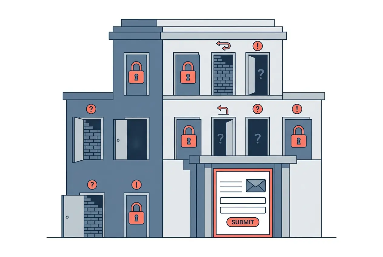
Quiet Conversion Killers
UX for B2B is less about polish and more about lightening the load on a buyer who is comparing several suppliers while running a live project. The job is to make the site effortless to read and act on.
One analysis of web design statistics found that 94% of first impressions relate to design, but a strong impression in B2B means something specific: the site feels built for someone like them, the navigation is predictable, the services are described plainly, and the next step is obvious.
- Several design choices quietly cost conversions and never show up on a report:
- Service pages that describe what you do instead of what you solve
- Navigation built around your internal org chart rather than how buyers search
- A contact form as the only way forward, even for early-stage visitors
- Mobile layouts that bury your best credibility signals below the fold
- Generic stock imagery where real projects and real teams should be
None of these need a full rebuild. Most need a fresh review by people who know how B2B buyers move through a site, and the discipline to choose function over preference when the two clash.
What a Good Brief Builds
A site built from a commercial brief looks different from one built on a visual brief, and the difference shows in the results, not the screenshots.
A commercial brief names the audience before the design direction. It defines the buyer types, their context, and the questions they bring. It maps conversion paths for visitors at every stage, not just the ones ready to enquire. And it treats speed as a constraint, not an afterthought.
Maisona starts with the strategy behind the brief, not the brief itself. The Axiom Built project is a useful example: the site was built to support a move into Tier 1 infrastructure, so the design, the messaging order, and the credibility signals all had to match what major infrastructure procurement expects. You can see how that played out across the Maisona case studies.
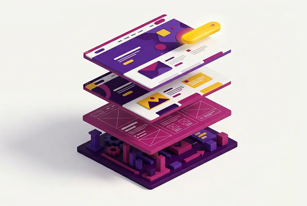
The website design process runs through six phases: discovery, UX planning, design, development, launch, and support. UX planning comes before design on purpose. Structure, navigation, and conversion flow are decisions to settle before anyone opens a design tool.
Good Looking vs Hard-Working
A site that converts well does not always look better than one that does not. It just makes smarter choices, and you can spot them once you know where to look:
- Specific, sector-relevant headlines, not generic positioning lines
- Proof placed exactly where buyers are weighing you up
- Staged conversion paths that meet buyers where they are
- Mobile performance treated as seriously as desktop
- Page speed that does not punish a slow connection
B2B landing pages convert at 13.28% at the top end, against an industry average near 1.8%. That gap is not about how the page looks. It is about how well it understands the buyer, clears friction, and earns the next step.

If your site was briefed on how it should look rather than what it should do, the gap between potential and performance is probably showing up in your pipeline. The fix starts earlier than most expect: at strategy, before the first wireframe is drawn.
Maisona builds B2B websites with performance, conversion, and sector-specific positioning in the brief from day one. If your site looks good but your pipeline does not reflect it, talk to our team about what a commercially structured approach looks like for your business.
Frequently Asked Questions
What is the difference between good-looking and effective B2B website design?
A good-looking site meets brand and aesthetic standards. An effective one is built around how buyers decide: it answers their questions in order, removes friction at each stage, and gives them a clear next step. The best sites do both. When the two conflict, function should win.
Why do B2B websites fail to convert despite looking professional?
Usually because the brief focused on appearance, not buyer behaviour. The site looks polished but still uses generic messaging, buries credibility below the fold, offers only one conversion path, or loads slowly on mobile. These are structural problems, not visual ones.
How does page speed affect B2B website performance?
It affects both conversions and rankings. Research by Deloitte and Google found that a 0.1-second load time improvement lifted lead generation form completions by 21.6%. Google also uses Core Web Vitals, including speed, as a ranking signal, so a slow site loses visitors and ranks below faster competitors.
What should a B2B website brief include?
Your target buyer types and their context, conversion paths for each decision stage, performance requirements alongside visual ones, and sector-specific credibility signals. The UX structure should be planned before design begins.
How often should a B2B website be reviewed or rebuilt?
Run a structured review every 18 to 24 months, or sooner if you have repositioned, added service lines, or seen enquiries decline. A site built for where your business was two years ago may not reflect where it is now.