5 Signs Your B2B Website Design Is Costing You Leads
By Gianna Stead | SEO Manager, Maisona | 5 min read
Your website is doing one of two things right now: building the case for your business, or quietly dismantling it. For most B2B companies, the answer sits somewhere in the middle, and that middle ground is where pipeline goes to die.
The problem with B2B website design is that the gaps rarely announce themselves. Your site works. Pages load. The contact form submits. But the right visitors arrive, scan for thirty seconds, and leave without making contact. That is not a traffic problem. That is a conversion problem, and it often comes down to issues a good SEO and website audit would surface in the first session.
Here are the five signs your website is costing you leads, and what to do about each one.
Your Site Takes Too Long to Load
Speed is not a technical nicety. It is a commercial variable. According to Google research, 53% of mobile users abandon a site that takes more than three seconds to load. For a B2B audience doing preliminary research on suppliers or contractors, that is a prospect gone before your value proposition appeared on screen.
Slow load times also affect where you rank. Google uses Core Web Vitals, which include load speed, as a ranking signal. A site that loads slowly is penalised twice: once in search rankings, and again when the visitor who did find you decides not to wait.
Run your site through Google’s PageSpeed Insights. Look at your Largest Contentful Paint score. If it sits above three seconds on mobile, your site has a speed problem that no amount of content or paid traffic will compensate for.
Your Navigation Makes People Work
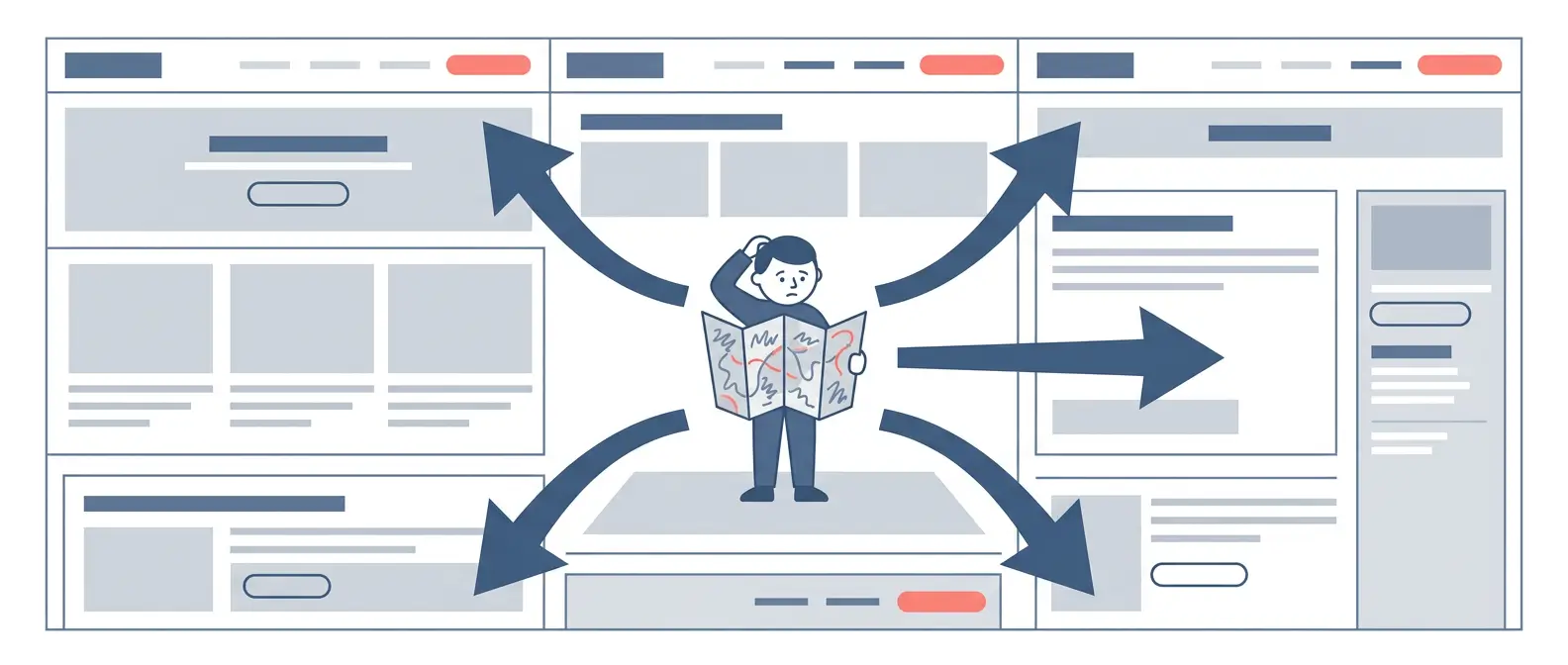
A visitor landing on your site for the first time has one immediate question: am I in the right place? Your navigation exists to answer that question in under three seconds. If your menu is buried, your service pages are ambiguous, or there are five ways to get to the same destination, you are creating friction before the conversation has started.
This matters more in B2B than in consumer contexts. Your buyers are busy. They are comparing options across multiple suppliers while managing a project schedule. A site that requires effort to understand communicates, subtly but clearly, that working with you might require the same effort.
The fix here is rarely a full redesign. It starts with a fresh set of eyes. Walk someone unfamiliar with your business through your site and ask them to find your key service. Watch where they hesitate.
Your Messaging Does Not Speak to the Right Buyer
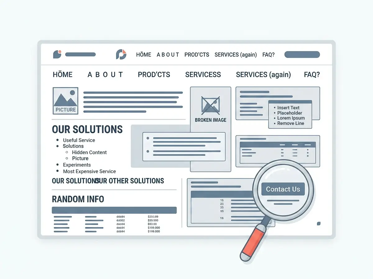
Most B2B websites describe what the business does. The best ones explain what the business solves. There is a substantial gap between the two, and buyers feel it immediately.
“We provide integrated civil construction services across New South Wales” tells a procurement manager nothing useful. “We reduce programme delays on civil infrastructure projects through embedded site coordination and real-time reporting” tells them exactly why to read further. Specificity is the difference between a site that holds attention and one that loses it.
Good messaging also signals who you do and do not work with. A business owner in the industrial or distribution sector reading your homepage should see themselves reflected in the problems you describe and the outcomes you have delivered. If your copy could belong to any agency or contractor in your category, it is not working hard enough.

There Is No Clear Next Step
This is the most common issue Maisona sees in B2B website audits, and it is fixable in an afternoon. A visitor reads your services page, finds what they are looking for, and then nothing obvious happens. There is no clear call to action tied to where they are in the decision process, or there is a generic “Contact Us” button that asks for commitment before the relationship has been established.
Effective B2B website design treats the call to action as a conversion moment, not an afterthought. The right CTA depends on where the visitor is:
- Awareness stage: An educational resource, case study download, or explainer that adds value without requiring commitment.
- Consideration stage: A scoping call, site audit, or strategy session framed as genuinely useful, not a sales meeting in disguise.
- Decision stage: A direct path to a conversation, quote request, or project brief submission with minimal friction.
Your Site Does Not Hold Up Under Scrutiny
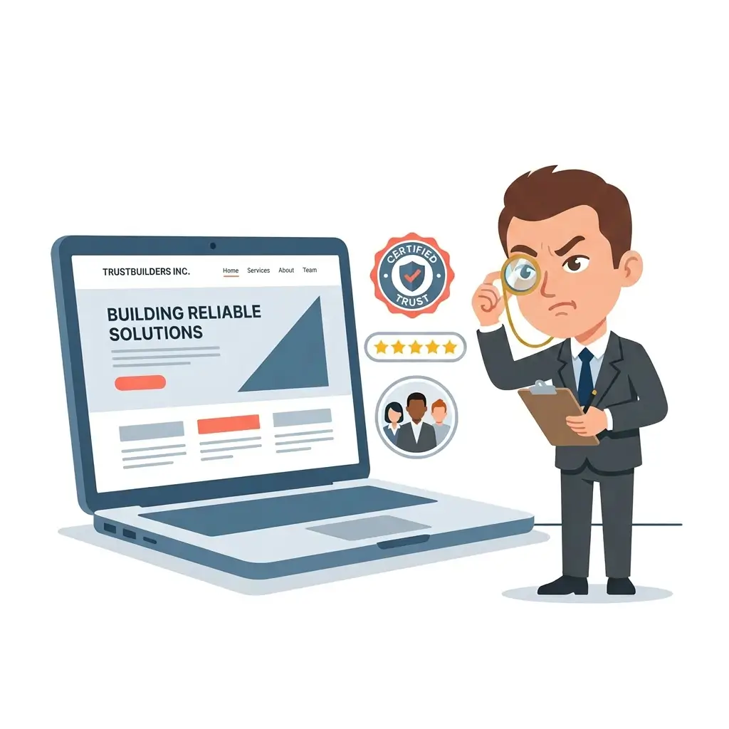
Your B2B buyer does not convert on the first visit. They come back. They show colleagues. A procurement manager forwards your URL to the operations director before a supplier meeting. That second visit is the real credibility test, and most websites fail it.
Forrester research found that visit-to-lead conversion rates are more than 400% higher on sites with a superior user experience. In B2B, this plays out across every touchpoint: the case studies you do or do not include, whether your team page feels like real people or stock photography, whether your project portfolio matches the scale of the work you are pitching for. If you want to see what credible B2B positioning looks like in practice, Maisona’s case studies show how that plays out for businesses in construction, civil, and industrial sectors.
A site that looks credible handles objections before they are raised. It shows evidence of the work, not just descriptions of it. It names the sectors you serve, the scale you operate at, and the outcomes clients have achieved. Without those signals, even a technically sound site can feel thin when it matters most.
What to Do Next
These five issues share a common thread: none of them require a full rebuild to start fixing. Speed, navigation, messaging, CTAs, and credibility signals are all addressable as structured improvements, either on your existing site or as part of a planned redesign.
The question worth asking is whether your current site reflects where your business is now, not where it was when the site was built. For most growing businesses, those two things have drifted apart, and the gap shows up as missed leads and quiet pipeline.
Maisona’s B2B website design services are built for exactly this: identifying what is holding your current site back and building something that works harder. If your current marketing is generating activity but not pipeline, talk to our team about what a properly structured website should be doing for your business.
Frequently Asked Questions
What makes a good B2B website design?
A strong B2B website design is clear, fast, and built for the buyer’s decision-making process. It communicates specifically who you serve and what problems you solve, routes visitors toward the right next step based on where they are in their decision, and holds up under scrutiny when buyers return with colleagues or decision-makers.
How do I know if my website is losing me leads?
The clearest indicators are a high bounce rate on key service pages, low time-on-site, and a contact rate that does not reflect your traffic volume. Tools like Google Analytics and Hotjar can surface where visitors drop off. A site audit by an experienced team will identify whether the issue is speed, messaging, navigation, or missing conversion signals.
How long does it take to improve a B2B website?
It depends on the scope. Targeted fixes to speed, CTAs, and messaging can be made within days on most platforms. A full UX review and redesign for a mid-sized B2B site typically takes six to twelve weeks, depending on the number of service lines and the complexity of the build.
Does website design affect SEO?
Directly. Page speed, mobile responsiveness, and clear site architecture are all factors Google uses to rank pages. A slow or poorly structured site costs you rankings before a visitor has read a word. Technical site health and SEO are not separate concerns.
What should a B2B homepage include?
A B2B homepage should immediately confirm who you serve, what you do, and what makes you the credible choice. It needs a clear hierarchy: problem or audience identification first, service overview second, proof of outcomes third, and a frictionless next step.